Tuesday, March 29, 2011

Decorating Architectural Niches

Architectural niches seem to be a trend in newer home construction.

While they look cool and are meant to add architectural interest to lack-luster vanilla homes, 
they often leave home owners {like us} wondering what to do with them.

These decorative wall recesses were built most extensively in ancient Roman times with the purpose of displaying statues, vases, and art pieces.

So what do you do if the thought of a typical vase filled with artificial flowers


or a quirky statue just doesn't float your boat??

I've struggled with this myself in our home.
When you walk in our front door, our architectural niche stares you right in the face.
Putting a vase in it is so expected.
And I'm really not thrilled about the idea of hanging a picture or placing a statue in it either.

I've tried filling it with seasonal decorations that are welcoming to guests,


but still... 
it just looks so plain.

So I'm on a quest to figure out how to spice it up a notch.


I love the idea of painting the back of it a fun color and adding crisp white shelves.


But dark wood shelves look good too...


Maybe a textural wallpaper would be better than paint...

Christmas 2010 traditional

Oooohhhh, glass shelves are a nice touch...


Love the cheery yellow, but it probably wouldn't flow well in my house...

How cool would it be to add something unexpected to the back of the niche...

like a mirror...

Niche contemporary bathroom

Or a tile mosaic...

Lagoon Residence @ Belvedere modern bathroom


Or even corkboard or chalkboard paint...

What I would really love though is to find a pair of these babies...

French Larkspur eclectic dining room
to prop up in my niche.

Finding them, though, might prove to be quite a challenge! 

So many options...
I'll keep you posted when I figure it out!

Tuesday, March 22, 2011

Bookcases: Not Just for Books

One of my current projects is giving this bookcase a much-needed makeover.

{I can't believe I just showed you that mess!}

And my last post talked a little bit about adding color to the backs of bookcases...

So I guess I've kinda got bookcases on the brain lately.

One aspect of home decorating that can be a little tricky is accessorizing your bookcases,
so I thought I'd write a post offering some helpful tips
on how to make your bookcases more visually appealing.

First of all, bookcases are not just for books.

Unless, of course, you want your room to look like a library...

{Source: Apartment Therapy via Pinterest}

or you can pull off a cool look like this...

 {Source: Elle Decor}

 I know, it's tempting to shove every book you own in your bookcase.
After all, they are meant to store books, right?


Most often, however, a bookcase stuffed full of books makes the shelves look cluttered 
and throws off the balance of a room.

There are no hard and fast rules when it comes to decorating...
But, a good rule of thumb is to shoot for filling only 1/3 or less of your bookcase with books.

So how do you know which books to display???
Hardbound books look classier for displaying, so store the paperbacks elsewhere.

Consider the color palette of the room.
Which books will add to the overall aesthetic appeal of your space?

{Source: Real Simple}

{Source: Real Simple}

Don't be afraid to remove dust jackets.
Often times, books are hiding pretty colors under their jackets.

Consider what you love...
your book choices should be a reflection of you, your hobbies, your interests. 

{Source: HGTV}

{Source: Real Simple}

Once you've chosen which books to display, now how do you organize them?

Try to arrange books not only standing vertically, but stacked horizontally as well.

{Source: Room Remix Blog via Pinterest}

For an unexpected look, you can also turn the books around so that they pages are facing you.

Try placing the books in groups of five or ten.
It adds visual interest and keeps the bookcase from becoming repetitive.
Make sure the books don’t line up shelf after shelf. Place some to the right of the shelf, and on the next shelf try splitting two or three books on the left and the right. 

Placing some books in baskets or bins also breaks up repetitiveness.


If you're going for a cottage-y look, you can cover your books in white or tan paper.

{Source: Southern Living}


I've filled up 1/3 of my bookcase with books. What about the other two-thirds??

To keep your bookcase from looking cluttered,
it's a good idea to leave another 1/3 as empty space.

The final third should be filled with carefully chosen accessories.
Accessories that reflect you and the style of your room.

 {Source: HGTV}

As Nate Berkus says, the best decorated rooms are rooms that have been
"collected over time."
What that means is, don't rush out and buy a bunch of accessories all at once to fill your shelves.
Instead, display objects that you have collected on various travels,
things that are meaningful to you and your family,
family heirlooms,
things you love.

{Source: Phoebe Howard}

When placing your accessories in the bookshelves,
consider height and depth as well as placement.

Vary the height of objects by placing them on top of stacked books or decorative boxes.

{Source: HGTV}

To add some depth, tall objects,
such as plates, framed pictures, trays, and pieces of art
should be placed at the back of the shelves to serve as a backdrop for your display.

 {Source: Real Simple}

{Source: Design Sponge}

Be careful of of tiny tchotchkes as they tend to create a cluttered look too.

Instead, choose bigger bolder accessories that can be seen from across the room.

You can give smaller items more presence by collecting them in a pretty container,
such as a glass jar filled with old photos or a pretty bowl filled with stones.

{Source: Pottery Barn}

And don't be afraid to add some color or texture to spice up your bookcase...

 {Source: Ideal Home Magazine}

Wallpaper and paint are cheap ways to dress up a plain bookcase.

 {Source: Real Simple}

As Elizabeth Mayhew from House Beautiful stated,
"Don't just fill your shelves. Color them, arrange them, decorate them, dress them, personalize them. The books you store on your shelves are just the beginning."

Monday, March 14, 2011

Redesign: Paint Colors for Jessica's House

I was honored when a sweet gal named Jessica wrote to me asking for some guidance in decorating her new house. 

Jessica loves color and was craving some in her house, but after trying out 19 different colors of paint on her walls, she was having a hard time making decisions.  

Like so many of us, myself included, Jessica has a house with an open floor plan where rooms share walls and ceilings. 
This can make the process of choosing colors for spaces rather difficult.

In my own house, I've found that when several different rooms are seen together, it's very helpful to map out a color plan for the entire house first.
Making a color map or plan helps create a unified environment because each color is supported by others in a harmonious palette.

Here are two examples of color plans to give you an idea of what I am talking about...


{Source for above images: Pottery Barn HOME} 

Based on what I learned about Jessica's preferences, her current furniture, and the layout of her house, here is the color plan I came up with for her...

{The above colors are all made by Benjamin Moore. Please note that computer screens can alter the way a color actually appears, so be sure to test swatches that you are considering first.}

If you have a home where the rooms flow together, choose neutral colors for central spaces and build upon them. 

Jessica's central spaces include her entry, dining room, and family room, which is why I chose the neutral colors Clay Beige and Collingwood.

One way Jessica can get the color she craves is by adding in rugs, pillows and other accessories to compliment the above soothing neutral colors.

Another way to showcase color is to add colorful paint in small doses. This can be done by painting smaller areas or rooms in the house, accent walls, pieces of furniture, or the back walls of bookcases. 

Here are some examples of ways to add color to neutral backdrops...
 {Source: Apartment Therapy}

{Source: Good Housekeeping}

dominomag eclectic living room
{Source: Houzz}

AND Interior Design Studio mediterranean living room
{Source: Houzz}

Photobucket
{Source: House of Turquoise}

To add some color to Jessica's house, I suggested that she paint the backs of her beautiful white built-in bookcases a soothing shade of Buxton Blue.
Leaving more open space in the bookshelves and only displaying a select number of books 
and carefully chosen accessories would allow for the blue to peek though 
in an attractive display.

Additionally, it would be easy to paint her office a shade of green with more saturation
{like Guilford Green}
since the room is closed off and does not share walls with other rooms in the house. 
However, the green would be visible from other parts of the house since the office has glass doors so it is important that the green coordinates with the color palette in the rest of the house.


To carry the green from the office into other parts of the house, 
I suggested painting the kitchen and breakfast nook a lighter, 
more subtle shade of green {Soft Fern}.


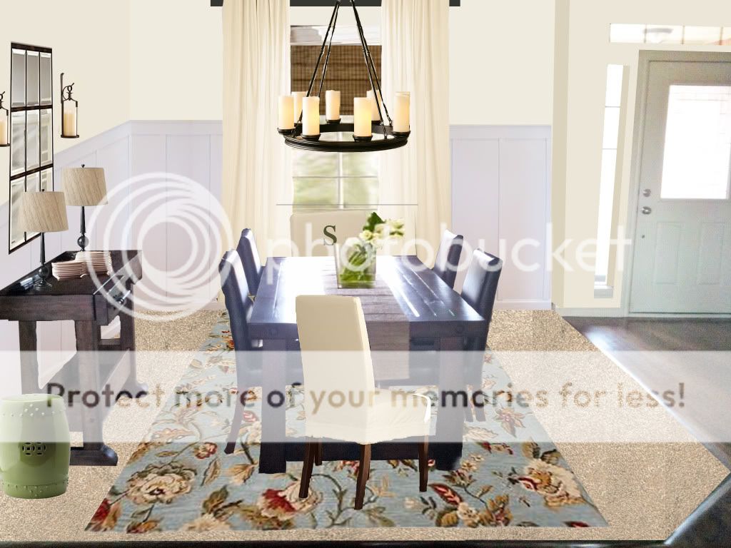
Just for fun, I gave Jessica's dining room a virtual makeover to show her what it could look like with a new, lighter neutral paint color and some subtle pops of color.

{Hover your mouse back and forth over the below image to see the transformation}

Jessica had already purchased the GORGEOUS table, chairs, and bar 
from Pottery Barn, so all the room needed was a little remixing.

Almost everything I added into the room is also from Pottery Barn: 
Rug: Vanessa Floral Rug in Blue
Drapes: Peyton Drape in French Ivory 
Mirror: Eagan Multipanel Small Mirror
Candleholders on wall: Artisanal Wall-Mount Candleholders
Lamps:  Gillian Candlestick Bedside Lamp Base with Natural Fiber Tapered Drum Shades
Head Chairs: Napa Chair & Monogrammed Slipcover
Chandelier: Veranda Round Chandelier

Jessica actually had this rectangular chandelier in mind...
but I couldn't get the angle right to fit in into the virtual makeover,
so I stuck the round one in to giver her an idea of what the style of chandelier would look like.

I also added in some white board and batten paneling to the two dining room walls.
This helps define the space and separate it from the other adjoining rooms.
The crisp white paint of the paneling also adds some brightness to the room 
so that it doesn't feel too heavy with the dark wood furniture.

Here are some great tutorials written by fellow blog gals on how to do Board & Batten Paneling...

Here is one more look at the before and after of Jessica's dining room in case the above rollover wouldn't work on your computer...

I hope that helps you, Jessica!
Remember that there is no "right" way to decorate; just do what YOU love!